Irontite
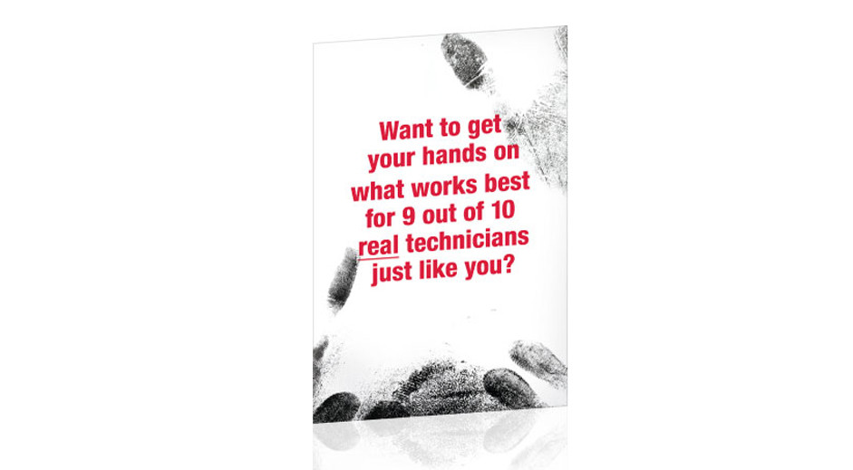
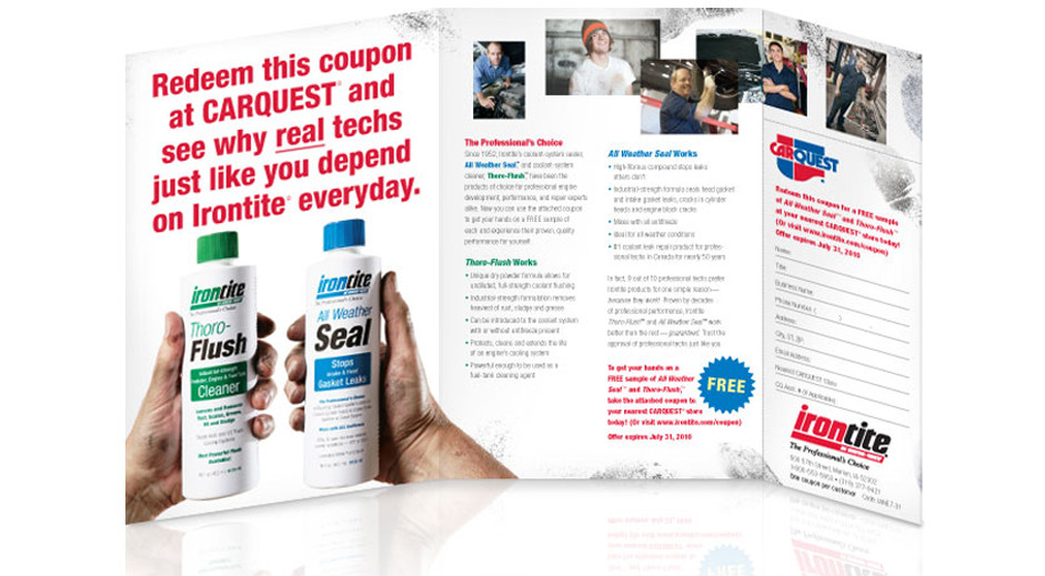
We were thrilled to help Irontite clean up their brand identity and packaging, but our big idea for their direct mail campaign with CARQUEST® was a little more gritty. When we were developing ideas for Irontite, we visited several auto repair shops to get a better feel for their target audience. We noticed there were greasy finger prints everywhere: on the phones, the keyboards, the job tickets. If they touched something, it left a mark, and that left a mark on us, too. We proposed that everything we designed for them should have greasy looking fingerprints on them—even the packaging in the store. Well, we didn’t persuade the client to put the fingerprints on the packaging, but we did leave our mark on their brand.
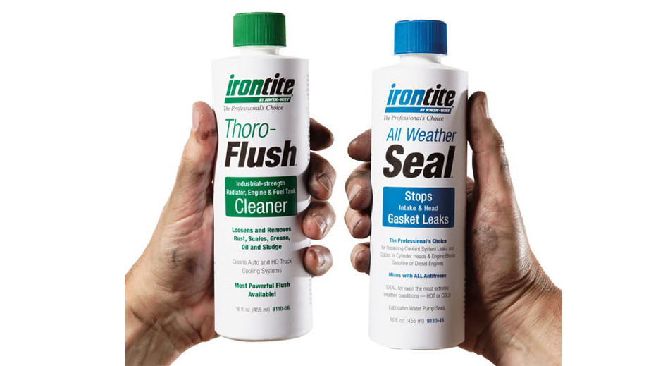
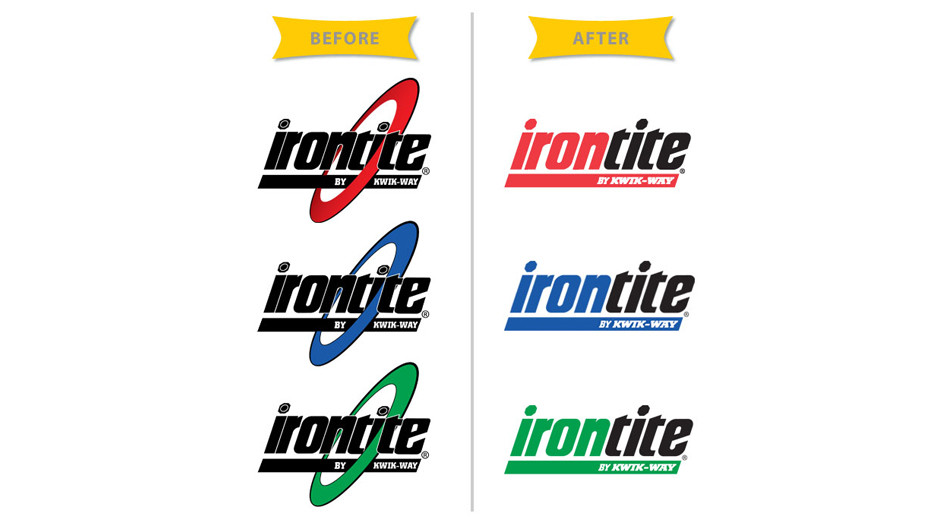
When Kwik-Way bought the Irontite company, the original Irontite logo had a red, blue, or green ring around the black Irontite wordmark and the lettering was scrunched very tightly together. Unfortunately, when the logo was reduced to a smaller size on packaging and other branding materials, the name was nearly unreadable.
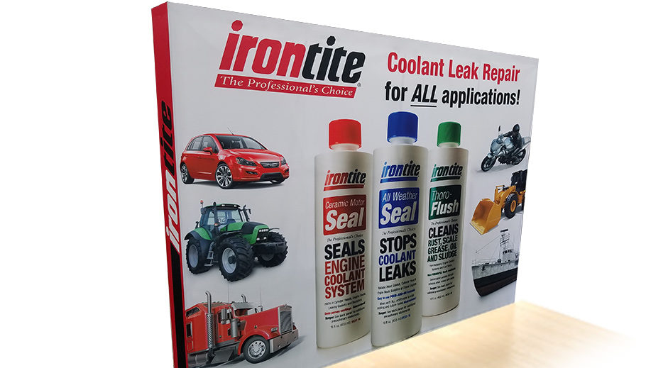
Our solution was to remove the ring, redraw the lettering in the wordmark to add more space between the letters, and most importantly, to make “iron” in the wordmark and the black bar below it either red, blue, or green. This made the logo more readable and also helped differentiate the products.
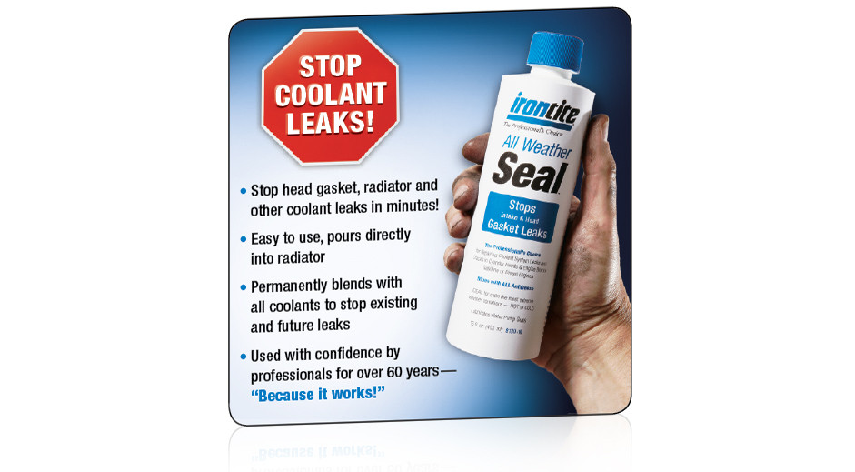
During the the Discovery Phase of our creative process, we realized mechanics working in garages had difficulty determining which product was which, because the only difference between the “Flush” and two “Sealing” packages was the ring on the logo and the color of the small text.
Our solution began with the redesigned logo, which boldly displayed the different product colors in wordmark. Next, we made “Flush” and “Seal” large, black and bold so they would be easy to read. Then, we added a color block underneath the product name to help differentiate the products. And finally, we recommended using colored caps that matched the color scheme of each product. Previously, the lids where white and didn’t help mechanics to identify different products.
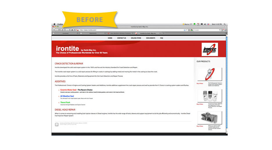
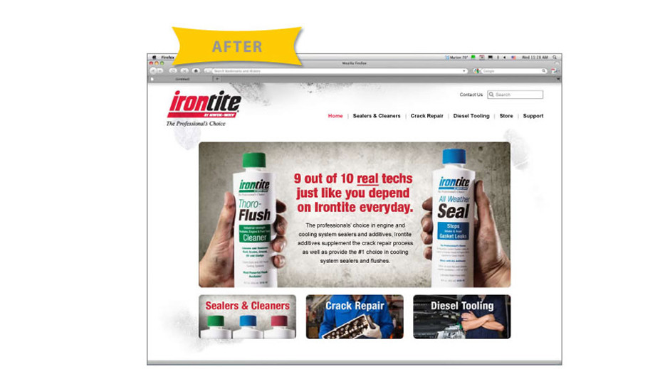
We also worked with the Kwik-Way team to redesign the Irontite website. The existing website was mostly text and used black and white photos. The navigation was very confusing. Our recommended redesign featured large, colorful photography and bold headlines. We designed the product pages with large “window shade” navigation, so the overwhelming amount of information could be compartmentalized and easily “opened” or “closed” by the user.
After developing several iterations the client ended up working with a freelance programmer to redesign the site. Unfortunately, the only thing that made it from our designs and into the new website was a few greasy fingerprints.