


Kenwood Records
Kenwood Records is another client we’ve worked with for over two decades. Our initial project with Blaine Worley and his leadership team was to inject some life into their brand identity so they could expand their reach nationally. Although they wanted to continue to use the same logo they had used for years, they wanted their marketing materials to have more visual impact to ensure Kenwood Records would be noticed and remembered after every touch point in the sales funnel.
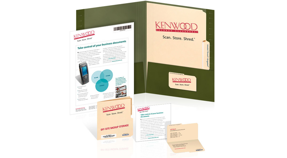
During our information gathering meetings, we noticed that even though Kenwood Records was offering modern digital scanning and storage technology, traditional manila file folders and hanging files were still what nearly every client worked with—so we made these standard office supplies the core of the new brand identity.
The pocket folder was designed to look and feel like a green hanging file, complete with die-cut, folded edges where a plastic file name tag could be inserted into it. All sales materials and documents were enclosed within manila file folders that looked as if the Kenwood Records logo had been rubber-stamped onto them in bright red ink, just like URGENT stamps. Business cards looked like miniature, die-cut, manila file folders that even had fold-lines stamped along the bottom edge, just like full-size manila folders. The die-cut tabs had “Kenwood Records” printed in ballpoint blue ink so they looked as if they had been handwritten by an office worker.
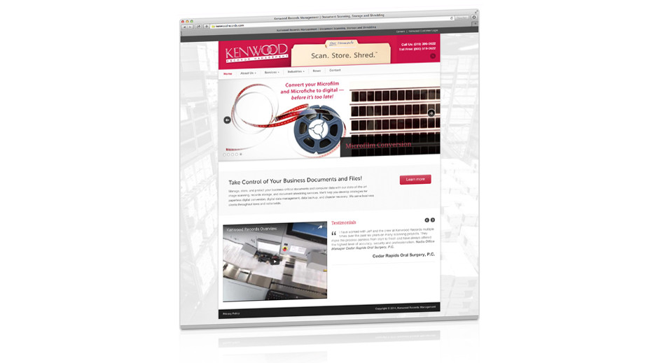
The new brand identity won several awards, but most importantly, it helped Kenwood Records win new clients and helped them grow. Over the years, we’ve helped them with advertising, direct mail, trade show booths, pop-up stands, vehicle graphics, and their website.