
Tektivity
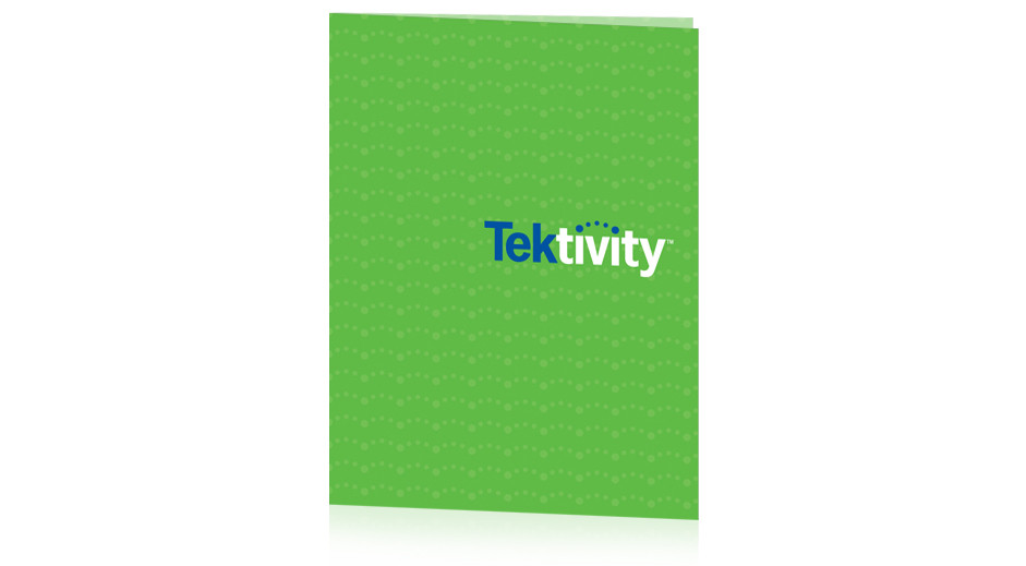
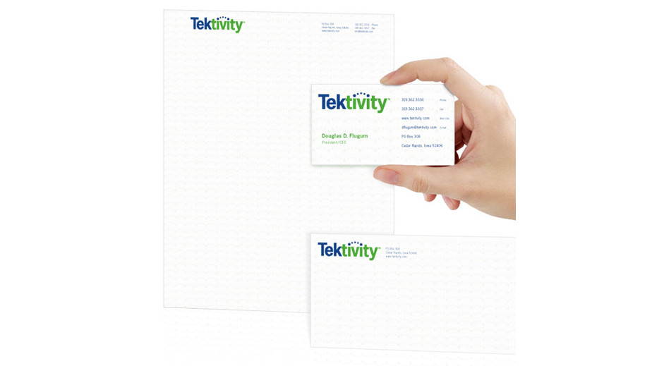
When Doug Flugum and Jon Cushing started their technology services company several years ago, they asked us to help develop their name, logo, and brand identity. We came up with a bold, colorful solution that connected the dots in the “i’s” to symbolize information and data sharing. The printed materials feature the five dots from the logo, subtly repeated in the background, to create a design element unique to Tektivity.
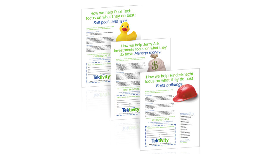
We developed a series of sales flyers that could be easily printed in-house whenever they needed them. Because the benefits of Information Technology (IT) and data services can be difficult for some people to grasp, we featured bold, colorful images to represent how Tektivity let’s businesses focus on what they do best: their business. An idea that everyone could understand.
We designed several Christmas cards for Tektivity that playfully replaced the five circles in the logo with ornaments and Christmas lights. We also created large banners for trade shows and their lobby that quickly explained what Tektivity does, boldly using the green and blue corporate colors and the subtle dotted design element.
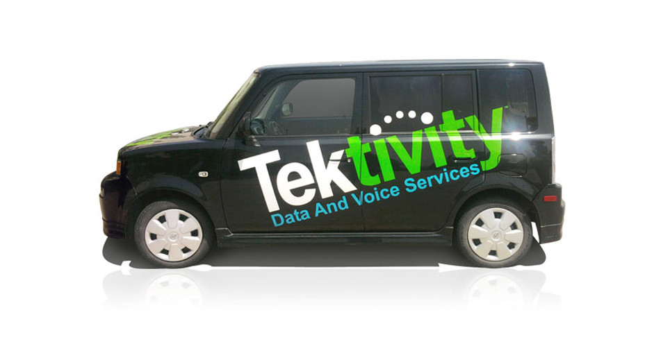
And nothing says “forward-thinking company” quite like a black Scion zooming down the road with a gigantic logo plastered diagonally across both sides!
Tektivity was recently purchased by Carrier Access, a national communication solutions provider. Doug started a new business, Bugeye Ventures, and he again asked us to create a new logo and identity for his next adventure. Checkout our Logos Portfolio to see how that one turned out.